A Comparison of Fountain Pens, Inks, and Papers
March 13, 2011
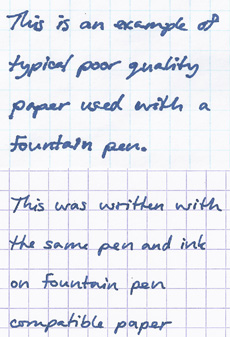
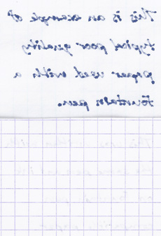
As a fountain pen user, I’m always on the lookout for good quality paper. Most of today’s mass-market paper is made for laser printers or ballpoint pens, the needs of the fountain pen user having been long forgotten. As a result, many notebooks, pads, and loose leaf papers are horrible for writing on with a fountain pen. These papers often have a rough texture, and produce excessive feathering, echo (show-through), and bleed-through:
Fortunately, good paper is available, and it isn’t always expensive (nor is expensive paper always good). In this article, I look at five different papers, and try each one with seven different pen-and-ink combinations. The following papers were tested:
- Moleskine Quad Ruled Pocket Notebook
- Clairefontaine Quad Ruled A4 Notebook
- Rhodia Dot Ruled A5 Pad
- Staples Sustainable Earth College Ruled 9½×6 Notebook
- Kodak Bright White Inkjet Paper
Note that this article is only testing the paper. It is not a review of the notebook or pad from whence it came.
Each paper was tested with these pens from my collection:
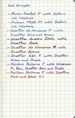
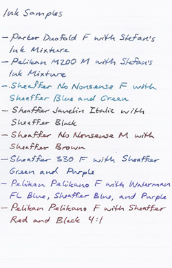
- 1942 Parker Duofold Jr. with a Fine 14K gold nib, using my own ink mixture.†
- 1990 Pelikan M200 with a Medium stainless steel nib, using the same ink mixture.
- 1990s Sheaffer No Nonsense with a Fine stainless steel nib, using a 1:1 mix of blue and green Sheaffer Skrip ink.
- 1984 Sheaffer No Nonsense with a Medium stainless steel nib, using brown Sheaffer Skrip ink.
- 1970s Sheaffer 330 Imperial with a Fine stainless steel nib, using a 1:1 mix of green and purple Sheaffer Skrip ink.
- 1989 Pelikan Pelikano with a Fine stainless steel nib, using a 2:1:1 mix of Waterman Florida Blue, and blue and purple Sheaffer Skrip ink.
- 1989 Pelikan Pelikano with a Fine stainless steel nib, using a 4:1 mix of red and black Sheaffer Skrip ink.
†My ink recipe consists of 75% Waterman Blue-Black, 9.6% Sheaffer Skrip Blue, 5.8% Sheaffer Skrip Black, 5.8% Pelikan Royal Blue, and 3.8% Sheaffer Skrip Brown.
Moleskine
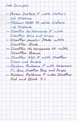
First up is the well-known, well-hyped Moleskine (pronounced Moll-Eh-Skin-Eh), the descendant of the notebook supposedly used by the likes of Ernest Hemingway. I tested the quad-ruled pocket notebook.
The Moleskine paper is a pleasant off-white colour, with grey ruling on a 5mm grid. It weighs about 75g/m² (20lb basis weight).
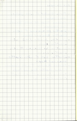
Mr. Hemingway must have used a ballpoint pen or pencil, because this paper exhibits significant feathering with all the pen/ink combinations, show-through with all of them, and bleed-through with all but the Pelikan pens. The feel of the paper is good, with enough texture to provide some feedback while writing, but not enough to make it feel rough.
Clairefontaine
Clairefontaine’s paper is probably the most often recommended when fountain pen friendly paper is asked for. I have a number of spiral-bound Clairefontaine notebooks in A4 and A5 sizes, and these are what I currently use for paper notes at work.
The paper is a very bright white color, with bluish-purple ruling, and weighs 90g/m² (24lb basis weight). The sample I tested is from my A4 notebook.
This paper exhibits virtually no feathering at all, extremely faint show-through, and no bleed-through. It is a very smooth paper, even with somewhat scratchy nibs. If a nib is exceptionally smooth, it almost moves over this paper too easily, with not enough resistance to provide feedback.
Rhodia
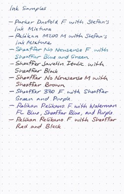
Rhodia paper is made by Clairefontaine, because the Rhodia company is owned by Clairefontaine. The paper is every bit as good as the Clairefontaine brand, but it is not exactly the same. It feels very slightly less smooth to the touch, although I’ve found that it actually feels smoother to write on.
It is also slightly thinner, at 80g/m² (about 20lb basis weight). The colour is again a very bright white, but a bit warmer looking than the Clairefontaine brand. The sample I tested is from a Rhodia “DotPad”, which is “ruled” with light bluish-purple dots on a 5mm square grid.
Despite being thinner than Clairefontaine brand paper, the Rhodia paper does not exhibit any more show-through. There is also no feathering, and no bleed-through.
Staples Sugarcane
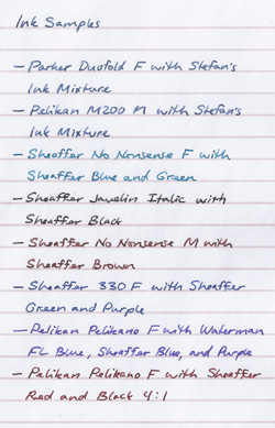
Staples’ Sustainable Earth paper is made from 80% sugarcane waste fibre. Whether this is more eco-friendly than making it from trees or recycled paper is debatable, but it is very nice paper, at a relatively low cost.
This white paper is very thin, weighing in at only 50g/m² (12lb basis weight). It is available loose-leaf, in pads, and in notebooks, with wide or college ruling in a brown kraft-paper colour. Sizes are 6×9½” and 8½×11″.
Despite its low cost, this paper has quite a smooth finish. It exhibits no feathering with any of the pen/ink combinations tested, although all produced a slightly bolder line than on the Clairefontaine and Rhodia papers.
As expected with such thin paper, there is significant show-through. Surprisingly there is no bleed-through. Although the show-through is clearly visible, it is still far fainter than the ruled lines, and is not objectionable when using both sides of the paper.
Kodak Inkjet
Inkjet papers are meant for use with liquid ink (although inkjet ink and fountain pen ink are very different). Thus, they are designed to resist feathering and bleed-through. This was especially important with very early inkjet printers such as HP’s ThinkJet, which could not print well at all on ordinary paper.
Because of these characteristics, together with the ease of printing one’s own custom ruling, inkjet paper makes a good general purpose fountain pen paper. The paper tested here is Kodak’s Bright White inkjet paper, weighing 90g/m² (24lb basis weight). I printed a very fine ruling on the paper for this test.
The performance of this paper is excellent, exhibiting minimal feathering, minimal show through (about the same as Clairefontaine and Rhodia), and no bleed-through. The texture is similar to that of the Rhodia, although it does not feel as smooth when writing.
Conclusions
If you want paper for extremely clear, crisp writing in a notebook or pad, Clairefontaine and Rhodia are the top choices. Both are available in both lined and quad ruled, and Rhodia is also available in the dotted form. Notebooks and pads are available in a variety of sizes (from pocket size to A4) and bindings (stapled, spiral, and cloth).
For an inexpensive notebook for school use, or if a bit of show-through won’t bother you, the Staples Sugarcane books are hard to beat for the price. The thin paper has the added advantage of packing more pages into the same size (and weight) of book. Unfortunately, the selection of sizes and rulings is somewhat limited.
If you’re a do-it-yourselfer, you can make very nice stationery using an inkjet printer and good inkjet paper (like the Kodak paper tested). You can even take those custom-ruled pages to Kinkos and have them spiral bound to make your own notebooks.
What about the Moleskine books? Well, frankly, they’re not worth the paper they’re printed on if you’re a fountain pen user. If you always use the same pen and ink combination, and it’s one that works with the Moleskine (like my Pelikan M200 with my mostly-Waterman ink), they can be usable, but I’d suggest testing first with a page from a generous friend’s Moleskine. I must admit though, that there’s something nice about the Moleskine books.
Related Articles
If you've found this article useful, you may also be interested in:
- Comparing Pelikan 4001 Blue-Black and Pelikan Edelstein Tanzanite
- Does the Demise of Cursive Writing Really Matter?

If you've found this article useful, consider leaving a donation in Stefan's memory to help support stefanv.com
Disclaimer: Although every effort has been made to ensure accuracy and reliability, the information on this web page is presented without warranty of any kind, and Stefan Vorkoetter assumes no liability for direct or consequential damages caused by its use. It is up to you, the reader, to determine the suitability of, and assume responsibility for, the use of this information. Links to Amazon.com merchandise are provided in association with Amazon.com. Links to eBay searches are provided in association with the eBay partner network.
Copyright: All materials on this web site, including the text, images, and mark-up, are Copyright © 2025 by Stefan Vorkoetter unless otherwise noted. All rights reserved. Unauthorized duplication prohibited. You may link to this site or pages within it, but you may not link directly to images on this site, and you may not copy any material from this site to another web site or other publication without express written permission. You may make copies for your own personal use.

Sailor Kenshin
June 03, 2011
Ohhh niiiiiice!!!!! Great paper comparison. Have you ever done anything with Miquelrius?
What ratio Sheaffer Blue and Green in your NN F? I like the color.
Stefan Vorkoetter
June 06, 2011
Sailor, the ink in the No Nonsense fine is a 1:1 mix of Sheaffer blue and green. Haven’t tried Miquelrius paper yet.
Michele Bullock
September 13, 2011
I REALLY enjoyed the paper comparison. A lot of concise information all in one small spot. Loved the format and comments. Thanks!
Sudhir Kothari
October 09, 2011
good paper comparison
Spiros Northwind
February 29, 2012
It is a great testing. I am going to use these results when I pick up my pen friendly stationery.Good job !!!
Amberlea Davis
March 17, 2012
Thank you for the review.
Ronc
May 23, 2012
Really enjoyed this review–thorough and well written. In fact, all of your pen/ink/paper-related articles are well written and thorough.
One erratum: Moleskine is pronouned Moe-luh-SKEE-nuh.
Lulu
June 10, 2012
I actually use a Chinese brand ink with my hero 96125 fountain pen, and I use that on regular notebook paper. Although it is somewhat show through, but it didn’t bleed through at all.
Brendan O'Reilly
October 09, 2012
Brilliant comparison – really appreciate it.
Andyhldn
December 07, 2012
Great write up of the different papers and inks. I was
pleasantly surprised that you would compare inkjet paper.
I was experimenting with it myself and found it to be one
of the better feeling writing papers I had tried (which
admittedly wasn’t many), with some of the troubling inks
that I have (cough-cough Noodlers Bay State Blue).
That ink just rode the paper effortlessly with no
skipping. And paper folds well enough that I may use it
for correspondence.
Jim
December 08, 2012
Thank you for the informative comparison. I have used Moleskine notebooks for years but only recently with a fountain pen. I found that the paper’s ability to handle fountain pen ink varies but have not been able to pin-point the variables.
On one piece of paper (Moleskine) I have text using three different pen-ink combinations. In general, the text written during the summer months seem to feather whereas text written in the winter months does not exhibit any feathering at all. I would conclude that humidity may have something to do with the feathering but will need to wait for humid conditions to replicate the effect.
Loan Kenney
August 11, 2013
Thanks for the comparison. I agree with your assessment as my experience with Clairefontaine, Rhodia, and Moleskine papers is similar to yours. I have not used Staples or Kodak papers. I whole heartedly agree with your conclusion on Moleskine. It only works with my Pelikan M400 F nib and Waterman ink. With other ink & fountain pen combination, the show through is terrible.
Kathy
June 06, 2014
I have purchased a few ‘tamarind’ hand made paper journals. I write with fountain pens. But every one I try bleeds through. Do you have a comparison of pens and paper ? Can you tell me a great fountain pen to use with Tamarind paper ? Thanks !
Stefan Vorkoetter
June 07, 2014
Kathy, some papers just won’t work well with fountain pens, but most can be made to behave by using a very dry ink, like Pelikan Blue Black, or Rohrer & Klingner Salix.
Marcel
September 10, 2014
Great stuff. I have only recently reverted back to fountain pen use, and agree that Moleskine is not suitable for “naive” pen/ink combinations. I am currently waiting for an EF nib for my M400 and shall see how that goes.
To be fair to Hemingway and/or Moleskine back then, there should be a little foldout sheet with a history of the notebooks in the back pocket; this says that the original company folded some time and was later revived by an Italian firm. I am not sure that they use the same paper that was originally used by Moleskine notebooks.
I have also ordered various notebooks to try (incl. Clairfontaine, Rhodia but also a few others), but am somewhat hesitant to tear them apart for little tests (admittedly a little silly).
One of the notebooks is a Zweckform one where the paper is grey with white squared ruling — they claim that this is nice to write on (more specifically, they claim that dark lines are more distracting), and that the brighter lines will become nearly unnoticeable when the paper is scanned or copied. I suppose that at least I could test without “defiling” the notebook before its time.
I have also bought a M205 Duo Fluorescent Green with B nib and am somewhat underwhelmed. The green is not as visible as I would have liked, considering the pen doesn’t lend itself to the same kind of broad highlighting as normal textmarkers. To make fluorescent notes, nice, but there a yet stronger colour might be more visible (and I’m glad I didn’t get the yellow one). One “normal” paper with some bleedthrough for normal ink with F and M nibs the bleedthrough is a lot more pronounced, I’d prefer to be able to highlight only on one side of the paper 😉 I’ll have to see how it does on more fountain pen friendly paper, but I’d say don’t chuck the normal highlighters just yet…
Lloyd Callaway
March 19, 2015
I assume the Kodak Brite White paper is the one with a matte finish, Is that correct? Can you recommend a source, please. Thank you.
Lloyd Callaway
March 19, 2015
Found article most helpful. Thank you.
Stefan Vorkoetter
March 20, 2015
Yes, it’s just matte paper, very slightly thicker than ordinary printer paper. I bought it at Staples.
David
June 01, 2016
I have never been a fan of the quad ruled paper. It reminds me too much of doing math homework. It is ideal for drawing graphs but for me, that is where it stops. I prefer regular lined paper as it helps keep my writing from the dreaded slant.
Stefan Vorkoetter
June 01, 2016
I like the quad ruled paper because it reminds me of doing math homework. 🙂