My Fountain Pen Collection
February 26, 2011
I didn’t plan on becoming a fountain pen collector. I really didn’t. I’ve always had at least one fountain pen since 1976, but I’ve never had more than four at once. Suddenly, in late 2010, I started to acquire more of them. Even though that was very recently, I don’t recall what triggered that sudden interest, but it was certainly helped along by The Fountain Pen Network, an on-line forum for fountain pen afficionados. In the space of two months, I went from four pens to fifteen, and I’ve acquired a few more since then.
This page shows each of the pens in (or formerly in) my collection, describes it in detail, and recounts how it became a part of my collection. The pens are shown in the order that I received them, and I’ll add new pens at the end of this page if my collection grows.
All of the pictures were taken from the same distance and with the same zoom settings, so the pens are shown with their correct relative sizes. Clicking on any of the pictures will display a larger, higher resolution version (generally 1400 pixels wide).
Geha 707 School Pen

Geha 707 with a Stainless Steel Fine Nib, from about 1976.
1976: The first time I encountered a fountain pen was at the age of twelve during a trip to Germany, where I saw my cousin using one to do her homework. Until then, I had used only pencils and ballpoint pens, so I was fascinated by the fountain pen and how it worked. I just had to have one, and my parents bought me this green Geha 707 school pen.
Unlike here in Canada where ballpoints are the norm, German school children do most of their work with a fountain pen. The two main brands at the time I received this pen were Geha and Pelikan, and their school pens are very similar.

Geha pen with modified Cross converter.
I used this pen in the 7th grade but eventually ran out of Geha ink cartridges, which were not available here in Canada. After that, I misplaced the pen, never to see it again until very recently, when my parents found it upon hearing of my new found interest.
The nib on this pen would be considered Fine by western standards. Like most school pens, it is also very stiff to reduce the likelihood of damage. This particular pen has a few blemishes, including teeth marks on the cap (I used to chew my pens and pencils, a habit I have long since broken), and some pitting of the nib (although the tip is still fine, and the pen writes well).
The biggest drawback to this pen is that it’s an orphan. The Geha company was purchased by Pelikan in the 1980s, and their pen division was shut down. Geha pens use Geha-specific cartridges, which are no longer available. Fortunately, I was able to modify a Cross piston converter to fit into the pen, so it can now be refilled from an ink bottle.
Sheaffer No Nonsense Medium

Sheaffer No Nonsense with a Stainless Steel Medium Nib, from about 1984.
1984: During high school, I had three Sheaffer cartridge school pens. These were about the same size as the Geha above, but had a clear barrel. Sadly, I don’t know what became of these pens, so when I started university, I bought this bright yellow Sheaffer No Nonsense pen at the campus book store. I used this pen throughout my undergraduate and graduate studies.
This pen’s nib is marked Medium, and it makes a bolder line than the Geha. Ink is supplied by Sheaffer cartridges, although a Sheaffer squeeze converter can also be used (something I didn’t know existed until relatively recently).
Pelikan Pelikano

Two Pelikan Pelikanos with Stainless Steel Fine Nibs, from 1989.
1989: Long after I misplaced my orphaned Geha pen and had been using a Sheaffer for years, I discovered these two Pelikan Pelikano school pens in the campus stationery shop at ETH in Zürich. They looked so much like the Geha pen of thirteen years earlier, that I was convinced that my first pen had been a Pelikano. I bought these two pens and several packages of ink cartridges, and wrote with one of them for many years until I ran out of ink (not knowing that Pelikan uses standard international cartridges, readily available in Canada under the Waterman brand).
Both of these pens have identical fine nibs, but I was never happy with the blue one. It always felt somewhat scratchy, so it sat in a drawer until quite recently, when Sean of PenRx adjusted the nib for me while we chatted at a local coffee shop. It turned out that the tines were simply out of alignment. Until that time, I didn’t realize how simple it was to adjust them. I’ve now been using both pens at work for keeping notes, using a Waterman Florida Blue ink cartridge in the blue pen, and Waterman cartridge refilled with a mix of Sheaffer Red and Black in the red pen. I may eventually seek out converters for these pens.
Parker Striped Duofold Jr.

Parker Striped Duofold Jr. with a 14K Gold Fine Nib, from 1942.
January 2011: Shortly after I ordered my first new-old-stock pens from Peyton Street Pens but before I received them, I found this Canadian-made 1942 Parker striped Duofold Jr. in a local antique store for $15. I didn’t really know what it was, so I took some pictures, and asked the folks on the FPN forums who suggested I snatch it up quickly!
This is a Vacumatic filling pen. To fill it, one unscrews a blind cap on the end of the barrel, exposing a plunger. The pen is then dipped into the ink up to the beginning of the section, and the plunger pushed and released a few times. Pushing the plunger forces air out of the pen, and releasing it lets ink be drawn in.
The plunger extends and retracts a diaphragm inside the pen, and like many such pens this old, the diaphragm had disintegrated. Fortunately, Sean at PenRx was able to open the pen, replace the diaphragm, and give the pen a good polishing to remove all the scratches.
Pelikan M200

Pelikan M200 with a Gold Plated Stainless Steel Fine Nib, from about 1990.

Refilled cap engraving.
February 2011: The Pelikan M200 was on my must-have list. In addition to their school pens, Pelikan makes a series of pens ranging from the M150 to the M1000, available in a variety of finishes and nib materials. Once past the M400, the pens start to become larger as well. The M200 is probably the most common pen in the series, and features a gold-plated stainless-steel nib, and gold-plated trim.
I found this one in the local on-line classified ads for $50. It was in reasonably good condition, except that about half the gold-plating on the Medium nib had been worn off and the gold colouring within the Pelikan logo engraved on the cap was mostly gone. To give the pen a less worn appearance, I polished the remaining plating off the nib, and refilled the cap engraving with gold paint.
Pelikan M-series nibs are easily replaceable by just unscrewing the existing nib and feed from the section, and screwing in a new one. During a business trip to Berlin, I purchased a new nib for only 16€ (about $21) from Zeichen-Center Ebeling, where I was able to try the nib before buying it. The photo shows the pen with the new nib installed.
This is one of my favourite pens. The nib is on the wide side of Fine, and the size of the pen is just right for my hand (with the cap posted). The design is simple yet elegant, in both function and appearance.
Parker 50 Falcon

Parker 50 Falcon Flighter with an Integrated Fine Nib, from 1979.
February 2011: This was another pen on my must-have list. It’s a Parker 50 Falcon, and furthermore, it is the all-stainless-steel Flighter model. I purchased this pen from a seller on ebaY, who inherited it from his grandfather and then stored it for almost 30 years.

Integrated nib, after straightening.
What makes the Parker 50 unique is the integrated nib. Unlike every other pen you see on this page, where the nib is a separate part, the nib and section on the Falcon are made from a single piece of stainless steel. To give the pen a more futuristic look, the nib area is polished while the rest of the section is frosted. The cap and barrel have a brushed finish. The band at the base of the section, and the clip, are gold plated.
One drawback to an integrated nib is that it cannot be replaced if it is damaged, and of course, mine was damaged when I received it. The last few millimetres of the tines were drooped slightly downward, which brought them too close together and too close to the feed. This made for poor ink flow and a very dry writing pen. Fortunately, I was able to straighten the nib, and the pen now looks good and writes well.
Both this pen and the Parker 75 above can accept either a Parker cartridge, or a Parker squeeze-type converter.
Pelikan Souverän M605

Pelikan Souverän M605 with Fine 14K Gold Nib, from 2011.
March 2011: I never thought I’d buy a pen from Pelikan’s Souverän series. Although Pelikans are less costly than other high end pens, the idea of spending $200 to $800 on a pen didn’t appeal to me. Once you get into the over $200 territory, the pens don’t actually get any better, they just get fancier.

The M605 in its presentation box.
Pelikan’s Souverän (Sovereign) series are of the same structural design as the Pelikan M200, but they are equipped with gold nibs, and come in a variety of styles and sizes. The Souverän M400 is the same size as the M200, while the M600, M800, and M1000 are progressively larger. The most common Souveräns have a barrel made of alternating coloured and transparent lengthwise bands of resin. There are also special- and limited-edition versions, such as the Polar Lights and Indian Summer models.
The M605 is an unusual pen. It does not appear in Pelikan’s catalogs, and was produced only for export. However, the German department store chain, Galeria-Kaufhof carries this pen as a store-exclusive product in Germany. In the last few years, they’ve had this 245€ pen on sale for 99€.

Closeup of the M605’s rhodium plated 14K gold nib.
During a recent business trip, I visited the Galeria-Kaufhof in Berlin. Unfortunately, they did not have the pen in stock. After leaving G-K, I headed over to Zeichen-Center Ebeling, an independent store specializing in writing, drawing, and drafting supplies. My goal was to purchase a new gold-plated Fine nib for my M200. Much to my pleasant surprise when I arrived, they had set aside a nib for me based solely on my e-mail that I’d be visiting that day, looking for a nib. To my even greater surprise, they had an M605, and for only 97€ (about $130 on that day)! To top it all off, they were willing to exchange the Medium nib in the pen for a Fine one at no extra charge.
This pen is the same size and shape as other pens in the M600 series. Capped, it is about half a centimetre longer than my M200, and posted it’s about 1cm longer. It is also very slightly larger in diameter. All the resin parts of the pen, including the section, are a rich medium blue. There’s a tinted transparent ink window at the base of the barrel, which shows about half of the ink reservoir. The trim and clip on this pen are palladium plated, whereas the nib is 14K gold, with partial rhodium plating. There’s a black jewel with the Pelikan logo on the top of the cap.
The pen writes beautifully, both with the original Medium nib (which I tried in the store), and the Fine nib (which I also tested in the store). I currently have the pen inked with Pelikan 4001 Royal Blue, which in addition to matching the colour of the barrel very well, is completely eraseable using a Pelikan Super-Pirat ink eradicator (of which I bought two).
Pelikan M205 Demonstrator
 with a Stainless Steel Medium Nib (about 1990).")
Pelikan M205 (2011) with a Stainless Steel Medium Nib (about 1990).
April 2011: When I first started collecting fountain pens, I knew I wanted either a clear blue TWSBI Diamond 530, or Pelikan M205 demonstrator. When I found out how huge the TWSBI is, I set my sights on the Pelikan, only to find out it had been discontinued. I had the opportunity to buy one for 76€ (about $102 at the time) when I recently visited Zeichen-Center Ebeling in Berlin, but I bought a Pelikan M605 instead, along with a new gold-plated nib to replace the one in my M200 whose plating had worn off.
When I returned home, I was browsing Richard Binder’s site and noticed that he still had these in stock, and was selling the body-only for $58 at that time. Since I had a spare gold-less nib, I decided to order the M205 body. When I installed the nib, I used a very small amount of pure silicone grease on the threads so that no ink would seep into the threads and spoil the pen’s apperance (a problem with transparent pens), or make it difficult to unscrew later due to dried ink.
The M205 series is a small step up from the M200. The design is identical, but instead of a gold-plated nib and trim, the M205 has a polished stainless steel nib and rhodium plated trim. It is available in black, white, red, transparent yellow (with a broad nib and a bottle of highlighter ink), and transparent blue. The inner workings of the pen are easy to see under good light, and the entire ink supply is always visible, although the blue tint obscures the ink’s colour.
Needless to say, this pen writes every bit as well as my M200 did when I first got it, since it’s using that pen’s original nib. I first inked this pen with a 6:1 mixture of Pelikan 4001 Royal Blue and Sheaffer black, a combination that gives a dark-yet-still-blue line.
Lamy 25P
.")
Lamy 25P with a Stainless Steel Fine Nib (1970s).
May 2011: During a recent trip to Germany, my parents visited some friends and happened to mention my interest in fountain pens. They immediately went looking for their old schools pens, and found this Lamy 25P and the ST below. They graciously gave them to my parents to pass on to me for my collection. Danke schön, Frau und Herr Stein!
I had never seen a 25P before, but a quick post to the The Fountain Pen Network resulted in a positive identification. The 25P was introduced in the 1970s as a school pen, and looks somewhat like what you’d get if you crossed a similar vintage Pelikano with a Lamy 2000. The pen body is brushed stainless steel, while the cap is “Makrolon”, the same black fibre-glass that the Lamy 2000 is made from.
The “P” in 25P stands for “patronen”, which is German for “cartridges”. For those only familiar with more recent Lamy pens, this one is unusual in that it accepts standard international cartridges, like those used by Pelikan and Waterman. Lamy’s proprietary cartridges do not fit. There were two short cartridges in the pen, one still sealed but only half full. I rinsed out the other one and filled it with a 1:1 mixture of Pelikan Royal Blue and Private Reserve DC Supershow Blue, and the pen still writes beautifully. Now I’m using this pen with Sheaffer Skrip Red for marking up drawings and schematics.
October 2012 Update: I had problems with this pen drying out, due to a cracked inner cap lining. Therefore, I modified a cap from another pen to fit, resulting in a Lamy Frankenpen .
Lamy ST
.")
Lamy ST with a Stainless Steel Fine Nib (age unknown).
May 2011: This is the second of the two pens my parents’ friends contributed to my collection, a matte stainless steel Lamy ST, with a Fine (or maybe Extra Fine) nib. The stainless steel is only a shell over plastic however, so the pen is not as heavy as it might look. The section is made of plastic, with a ribbed texture for better grip.
In addition to being quite light, the ST is a very slim pen, ideal for small hands. Capped, it is almost a perfect cylinder, flat at both ends. The end of the barrel behind the black trim ring is slightly smaller in diameter than the rest of the pen, and is designed to accept the cap (which clicks in place on the ring). This makes the pen quite long when posted, and I suspect that those users with hands small enough to comfortably hold the pen wouldn’t use it that way.

The Lamy ST is much shorter when capped.
The ST accepts Lamy cartridges or a Lamy Z26 converter (the Z24 converter will not fit). Like many of the Lamy pens, the nib is readily replaceable, and the ST uses the same nibs as the Safari and Studio.
This particular pen is in excellent cosmetic condition, although the original owner’s name is neatly and lightly engraved in the barrel. Under most lighting conditions, this is barely noticeable. I had a bit of trouble getting it to write without skipping, even after cleaning and adjusting the nib, so I ordered a new Extra Fine nib and a Z26 converter from Goulet Pens. The pen is now good as new.
Pelikan M640 Polar Lights Special Edition

Pelikan M640 Polar Lights Special Edition with Fine 18K Rhodium Plated Gold Nib, from 2011.
July 2011: This is it. The end of the line. The last pen I’ll ever want (except maybe a nice Parker “51”). Not long after I started collecting fountain pens, I discovered Pelikan’s Polar Lights special edition, part of their Beauties of Nature series. When I first saw it on Pelikan’s web site, I knew it was my “grail” pen.

The Polar Lights fountain pen in its rather large presentation box.
I also knew I’d probably never buy one, since the list price is well beyond what I would consider reasonable to spend on a pen. Then one day, a well known and respected on-line pen retailer began a clearance sale, and had listed, among many other great deals, a fine-nibbed Polar Lights for about one third of the list price. I pounced.

Closeup of the Polar Lights’ rhodium plated 18K gold nib.
The entire Beauties of Nature special edition series is referred to by the model number M640. This is part of the same M600 series that includes the blue and silver M605 in my collection. As such, it is approximately the same length, and has the same sized nib and same diameter gripping section.
The visible differences are in the cap and barrel. The cap of the M640 is about 4mm shorter than an M600 cap, and about 1mm larger in diameter. The barrel starts to widen gradually right behind the section, reaching about 14mm diameter at its widest point. Surprisingly, this extra thickness is not noticeable when holding the pen because it is in an area that is not in contact with the writer’s hand. The M640 series sports a rather wide straight clip, instead of Pelikan’s traditional pelican beak clip.

The defining feature of the Polar Lights pen is its lacquered barrel, inlaid with platinum. I have yet to see a photo that does it justice.
The most noticeable difference when handling the Polar Lights is the weight, which is about twice that of my M605. This is due to the metal barrel and brass filling mechanism, as opposed to the plastic used for both in the M605.
Polar Lights’ barrel is lacquered, beginning in black (or perhaps a very dark green) at the section, transitioning to a luminous green, and fading gradually to white just before the filler knob. This smoothly shaded background is inlaid with platinum accents intended to evoke the shimmering curtain-like striations visible in the Aurora Borealis and Aurora Australis. Having seen the northern lights myself several times now, I can say that Pelikan’s artist has done a great job at recreating them abstractly in a static object.
The nib on this pen (and many modern gold-nibbed pens) is made from 18K gold, instead of the more traditional 14K. This serves no useful purpose other than to satisfy the laws of countries where you can’t call something “gold” if it’s less than 18K (75% pure gold content). Structurally, 14K gold is a better nib material. The nib is completely rhodium plated so as to match the platinum inlays and silver-coloured trim of the rest of the pen.
I first inked this pen with Private Reserve Ebony Green, a deep dark green that both matches the spirit of the pen, and is sufficiently serious looking for everyday use.
My only complaint about this pen is that the nib was very slightly scratchy from day one. I inspected it under a loupe and could find no hint of misalignment, so I decided to polish it (using first 1µm and then 0.3µm lapping film). I was able to improve it somewhat, but it was never quite right. Since I had purchased the pen from an authorized dealer, I contacted Pelikan’s North American distributor. They asked me to send the nib unit in, which I did. A few weeks later, a brand new nib arrived. I installed it in the pen, and it wrote perfectly smoothly right out of the box, like a Pelikan should.
Parker "51" Special
 Nib, from about 1952.")
Parker "51" Special with Fine Octanium (Stainless Steel) Nib, from about 1952.
August 2011: Well, I couldn’t resist any longer and decided to find myself a Parker “51”, the pen originally advertised with the slogan, “Like a Pen from another Planet”. Parker produced the “51” from 1948 until 1972, with several variations along the way. This example dates from about 1952, and is a “51” Special, which I purchased through the The Fountain Pen Network classified ads.

Close-up of the hooded stainless steel fine nib.
The distinguishing feature of the entire “51” series is of course the hooded nib and feed. The intention of this design was to allow the use of a very fast-drying ink without having the ink dry out in the nib or feed. The result was a pen that looks really cool.
The Special was introduced as a lower cost alternative to the regular “51”. It is fitted with a stainless steel nib (of an alloy Parker called “Octanium”). The cap is frosted steel (“Lustraloy”) fitted with a shiny chrome plated clip, instead of the gold-plated or gold-filled versions of the regular “51”.

A view from the bottom, showing the feed and nib.
Early “51”s used the Vacumatic filling system just like that of my 1942 Parker Duofold. In 1950, Parker introduced the Aerometric filler, which is what my “51” Special has. To fill the pen, one unscrews the barrel, dips the nib in ink, and squeezes the filler sac four times, counting to five between squeezes. Each squeeze expels the air at the top of the sac through a breather tube, and then slowly draws in ink.
Had I known how nice a writer this pen would be, I would have bought a “51” much sooner. However, my experience with the Hero “616” led me to believe that it would be difficult to determine if one is holding the pen correctly, since the nib is almost completely obscured by the hood. Much to my surprise, this seems to be less of an issue with the Parker than with the Hero, perhaps because of the Parker’s more accurate alignment of the nib with the point of the hood.
This “51” has a fairly wet nib, an attribute that seems to be common to most pens in this series. I’ve found that I need to use a fairly dry ink, like Parker Quink or Pelikan Brilliant Black, to get the flow characteristics that I prefer. Having found the right ink, this pen has quickly become my favourite non-Pelikan fountain pen.
Pelikan 140

Pelikan 140 with Medium Gold Nib, from the early to mid 1950s.
June 2012: Okay, one more pen. I’ve got quite a collection of Pelikan pens, but did not have a single traditional green-striped one. I also did not have any Pelikans that are older than me. I rectified both of these shortcomings of my collection by purchasing a Pelikan 140 on eBay.
The Pelikan 140 was made from 1952 to 1965, and is the ancestor of today’s entry-level M200 series of pens. Unlike its modern counterparts, the 140 came equipped with a semi-flexible gold nib instead of the stiff steel nib now offered.
Unfortunately, my particular pen arrived with a cracked clear plastic nib collar (the sleeve that holds the nib to the feed, and in turn screws into the barrel). This is apparently fairly common in early production 140s, and Pelikan quickly phased these out and switched to more durable black hard rubber collars. I contacted the seller, who immediately sent me one of the latter.
Removing the old collar was not easy, because it remained stuck in the barrel instead of unscrewing (the nib and feed just slid out as I turned it). I was eventually able to turn it a few turns using a sharp knife, and then once it protruded from the barrel, using a pair of needle nosed pliers. After aligning the nib and feed, I slid the new collar in place, and screwed the whole assembly into the barrel. That collar is now also stuck, but the pen works fine.

My Pelikan 140 and a Soviet-era Russian mechanical watch.
Considering that this pen dates from the early to mid 1950s, a time when fountain pens were actually used regularly, it is in remarkably good condition. There is some brassing, but nothing serious. The resin from which the pen is made has only very fine scratches.
The nib of course is what makes the pen (well, technically, the nib is the pen; the rest of it used to be called a “pen holder”). This nib is one of the smoothest that I own, and it is also one of the wettest. Combined with the fact that it is a Medium instead of my preferred Fine, it writes rather boldly. At first I began to look around for a replacement nib, but I really didn’t want to risk disassembling the pen again, so I decided to try different inks.
Having never tried an iron gall ink, and knowing that these inks have a reputation for dryness (an ideal antidote for a wet pen), I decided to give Rohrer & Klingner Salix a try. Well, that ink certainly cured the pen. It is still a relatively wet writer (even compared to my Parker “51”), but not excessively so, and I really enjoy writing with it. In fact, I liked it so much, I bought a matching Pelikan 350 mechanical pencil a few months later:

The Pelikan 140 and a matching Pelikan 350 mechanical pencil with 1.2mm leads.
Namiki Falcon
September 2014: Coming soon!
TWSBI Mini

TWSBI Mini Stub Nib, from 2018.
October 2018: Coming soon!
Esterbrook J

Esterbrook J Firm Fine 2556 Nib, from 1948-1952.
April 2022: Coming soon!
![]()
![]()
![]()
![]()
![]()
![]()
![]()
![]()
![]()
![]()
Related Articles
If you've found this article useful, you may also be interested in:

If you've found this article useful, consider leaving a donation in Stefan's memory to help support stefanv.com
Disclaimer: Although every effort has been made to ensure accuracy and reliability, the information on this web page is presented without warranty of any kind, and Stefan Vorkoetter assumes no liability for direct or consequential damages caused by its use. It is up to you, the reader, to determine the suitability of, and assume responsibility for, the use of this information. Links to Amazon.com merchandise are provided in association with Amazon.com. Links to eBay searches are provided in association with the eBay partner network.
Copyright: All materials on this web site, including the text, images, and mark-up, are Copyright © 2026 by Stefan Vorkoetter unless otherwise noted. All rights reserved. Unauthorized duplication prohibited. You may link to this site or pages within it, but you may not link directly to images on this site, and you may not copy any material from this site to another web site or other publication without express written permission. You may make copies for your own personal use.
Joe
March 25, 2011
Great site! I enjoyed reading your descriptions… I to like Pelikans and Sheaffers.
Charles Voltz
March 29, 2011
Looks like we’ve traveled a very similar path. After years of using fountain pens, off and on in recent years, I discovered Peyton Street Pens earlier this year. Bought an NOS Sheaffer Imperial II – Deluxe and received a free Hero 616. Rediscovered a couple of No Nonsense pens in a drawer. Since then I’ve acquired two Pelikans, an M605 and an M200. Recently acquired two pens from early WWII, a Shaeffer Balance w/military clip and a Parker Duofold Sub-Deb, both with lovely see-through vertical stripes and vacuum fillers. Recently bought a Lamy Studio in stainless steel as a gift for my son, and my wife uses a Parker 75. And the Parker 50 Falcon is one of the few pens on my want list. Have I missed anything?
Stefan Vorkoetter
March 29, 2011
Hi Charles: Yeah, you missed the two Targas! But WOW, what a coincidence! And, I almost bought a Lamy Studio last week when I was in Berlin, but decided that buying two pens per trip was a bit much.
C Saint Martin
June 18, 2011
we love the fountainpens&beer ;.)
Adriano Jose Adriano Tereza
July 14, 2011
Beatiful collection!!!
Wesley Davis
September 04, 2011
Very nice. I also became interested in collecting these magnificent writing utensils in late 2008. Since then I have collected around 50 or so, with 2/3 being third tier; mostly wearever. I have some very fine Shaeffer pens that took me a long time to find at a decent price. I have two Parker 21’s and a 45 that I love to write with and am currently looking for a 51 that I won’t have to give my left arm for. Being a full-time college student can be a henderence, hope i spelled that right.
Stefan Vorkoetter
September 06, 2011
Wesley, you might want to consider a 51 Special like mine. These are generally less costly than a 51, and are the same in all respects except that the nib is stainless steel (but every bit as smooth as a gold nib; after all, it is the iridium tip that does the writing), and the finishes are all chrome or steel, never gold or gold plated.
Saket Bajaj
September 18, 2011
That is a great collection… I just liked all the Sheaffers…
Susi Rafati
December 18, 2011
Got here via FPN (yes, some do click on links). Thanks for the great post and for the handwriting samples (most important). Despite people’s different FP preferences, someone else’s reviews can still be invaluable!
G
March 29, 2012
You need to add a TWSBI 540 🙂
Stefan Vorkoetter
March 29, 2012
G, I think the TWSBI is too large.
Ernest Jones
April 02, 2012
I am disappointed you haven’t any Waterman pens in your collection but it is a very fine collection you have. I have three Waterman’s, a Carene, A Kultar and a Phileas but the pen I like the best is my BAOER. It is the smoothest writing pen in my collection.
Ernie from Chester, UK
Stefan Vorkoetter
April 02, 2012
Ernest, I’m afraid I haven’t really seen a Waterman pen that appeals to me. I do use Waterman ink in my two Pelikanos though! I was just looking at the Baoer pens at http://www.hisnibs.com/baoer.htm and they seem to be nice looking pens. Which one do you have?
Barbara
April 30, 2012
I enjoy reading your article and learning about pens….I have a Parker Ballpoint pen that has gems on the clip and the original box. Do you have any suggestions as to what site I might find out more info on this type of pen?
fournarios
August 15, 2012
Great site. I loved reading about your collection and how you got into the hobby. I have been bitten by the bug as well and am particularly interested in Pelikans.
Any advice about where to find old pens cheap? I’m thinking of yard sales, antique shops, as a starting point, as well as obvious places like the bay.
I think your photographs of your pens are brilliant. Would you mind sharing what set up you use to get such good results (ie lens, settings, etc.)? Whenever I take pics of pens (eg to sell) I tend to get part of the shot out of focus. I am using a Nikon D90 with an 18-105mm lens.
Thanks.
Stefan Vorkoetter
September 05, 2012
I use a Canon SX20IS on a tripod, shooting downward at about 45 degrees. The pen is laying on a piece of paper, and it’s just lit by the lighting in my workshop. The camera is about 80cm from the pen, so the ends of the pen are not significantly further from the lens than the centre of the pen. This eliminates both distortion and focus issues. All the photos were colour balanced and had their lighting adjusted in PhotoShop afterwards, but no other retouching was done (the pictures accurately reflect what the pens look like).
sum
November 23, 2012
can you please tell me how to replace the nib of any hooded fountain pen, like ‘Parker 51 Special’ or ‘Hero 616’? I have broken its nib and i don’t know from where to remove the nib.
Stefan Vorkoetter
November 23, 2012
Sum, all hooded nib pens are different, so there’s no one way to replace the nib on all hooded fountain pens. Also, for a vintage pen like the Parker “51”, it might be difficult to find a replacement nib.
Ron
January 10, 2013
You have a very nice collection on pens. I too like Pelikan and my favourite pen is the Pelikan M800. However, I have a couple of very good pens which I can recommend if you ever get the urge to buy more. The first is the Italix Parsons Essential – the only place I know where you can get that from is http://www.mrpen.co.uk. A Lorna Reed also posted a review of this on FPN. The other pen is the Kaigelu 316. It’s a cheap pen which you can get from ebay. My first experience of a cheap Chinese pen (Jihnao X450) was not a good one; perhaps I just got lucky but the Kaigelu has been very good and is outstanding value for money. One word of caution, you can’t post the Kaigelu, so if you like to write with the pen posted then forget it.
Sarah
March 03, 2013
I need to know if my M400 pelikan nib will fit into any really cheap pens. I sent the pen back but had to keep the nib as it was altered for me. What can I do with the nib now? The pen that it was in (a pelikan) just looked too cheap for the money. Thanks for any help!
Stefan Vorkoetter
March 03, 2013
Sarah, the M400 nib will fit in an M200 or M205. Not exactly “really cheap”, but a lot cheaper than an M400. Which model of M400 did you get, and what did you find cheap looking about it?
dennis
April 15, 2013
I can see that you have a good collection. I happen to have a Lady Sheaffer “Flamme” 14K gold nib vintage 1970. I can see that you still dont have this in your collectiion.
dennis
April 15, 2013
Can you tell me what refill cartridge to use? or does it have a compatible refillable cartridge? I haven’t used it for a while, will the internal mechanism be damaged?
Tine
April 17, 2013
This is a really great collection. I think i took you long time to find these gems. ? 🙂
Don
April 23, 2013
Hi Stef
Wanted to say I enjoyed reading this blog and you have some nice pens there.
I have recently re-discovered the joy off using fountains pens after coming across my old 1976 Parker 25 flighter, with rotted sac, I flushed it and used a spare orginal cartridge that still worked and the pen wrote fine.
Then I saw and brought a couple old pens in an auction buyig them both for $25 and now after finding out heaps about how to restore pens (FP Network) I have a nice Mentmore 46 and Parker 51, a couple off Platignums like I had at school.
Like you I seem to have started collecting, its easy to get hooked on pens.
Jim Marbut
April 30, 2013
Very good job on this site. I also have a few pens, but a couple I recently found need work. One needs nib,both need new sac. Any possible way you know someone I can get to work on these? Thanks in advance.
Partha Banerjee
August 09, 2013
Thanks for this great site.I have also collected 25 fountain pens in past few years.I have Montblanc Classic I44 Gold Plated Barleycorn,Waterman Edson Sapphire Blue,Parker Duofold Centennial 23k gold plated,Parker 75 five different models including a Premier,Pelikan Classic Gold Europa,Dupont Gordon Gold Plated,Parker 61 converter filler in two excellent colours,Sheaffer Imperial and Targa,Visconti for RM,Cross Century II and different models of Pilot etc.I especially like Duofold,Edson,Parker 75 and of course Montblanc.
Collecting Fountain pens is really an excellent hobby.They are ‘useful’ jeweleries.
Thanks and regards
Dave Garbern
October 29, 2013
I met you ages ago at an e-fly (MidAm’s or KRC?, I forget).
Anyway, I stumbled across your fountain pen webpage and wanted to see if you had interest in acquiring a Parker T-1 pen. I bought it new as a kid, was lying around in my workshop since, so consequently has a few blemishes. I was offered $xxx for it a while back but I never followed up.
I could list it on Ebay, but not entirely comfortable selling it that way. Any interest?
Hal Phillips
November 30, 2013
Hi Stefan-
Great pics and wonderful commentary! I too am a big Parker and Pelikan
fan. I noticed you fly and collect watches as well. I posted on FPN
recently about the connection of pens, watches and sports cars. What are you driving? I have an M BMW. I gave up the flying.
Thanks for the interesting post and views.
Hal
Stefan Vorkoetter
November 30, 2013
I drive a 2001 Saturn SL, a pretty ordinary car, but I like it. In the summer months (no snow tires), I average less than 5.8L/100km.
Freddy Lessly
January 12, 2014
I enjoyed reading about your collection, extremely interesting how you acquired the pens and how you came about likeing each individual pen! Thanks!
Joe Sciascia
September 15, 2016
You have a very nice collection of pens, particularly your Pelikans. I live in London U.K. and have over 1000 pens. Great to see other collectors around the world. Thank You.
Dmitry
January 06, 2017
I am a teacher and therefore write much enough. Prefer Chinese fountain pens with gold tip that were made in 60’s and that look like copies of Parker 51. Searching such a pen. If someone has and wants to sell, please, let me know. dsr1957@mail.ru
Stefan Vorkoetter
January 06, 2017
Dmitry, there is the Hero 616, which is still made, and looks like a copy of the Parker 51. Most of them write really well, but they do not have gold nibs. They are readily available, although you have to be careful to not get fake ones (yes, there are fakes of these cheap pens).
viji
March 25, 2018
I wanted know about sivler color sheaffer fountain pen you have because it is very attractive.I have searched for the model of that pen but didn’t get it.
thought you would help.
Stefan Vorkoetter
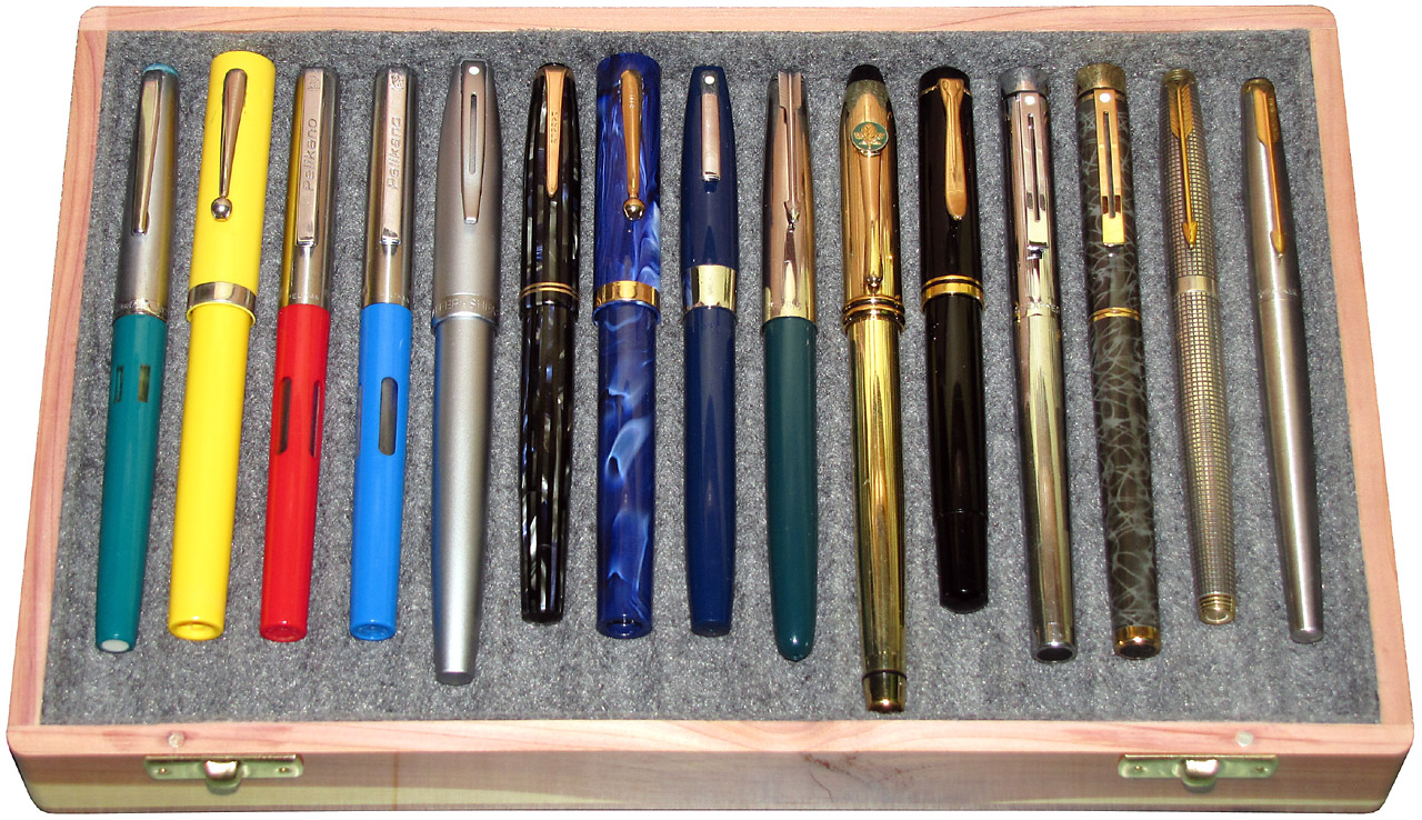
March 25, 2018
If you’re referring to the one fifth from the left in my box, it was a Sheaffer Javelin, which I purchased new in 2004 or 2005. If it is the one fourth from the right you are referring to, it’s a Sheaffer Targa 1001, from the 1980s or so. Neither pen is in my collection any more.
Carlos Toscani
January 08, 2019
Hi Stefan:
I found a fountain pen: “JACKSON PEN” – Made in U.S.A.
Do you know something about it.
Thanks in advance.
Carlos from Argentina.
Stefan Vorkoetter
January 09, 2019
No, I’m afraid I don’t. If you’re interested, I’d suggest asking on fountainpennetwork.com